Hey folks! Time for another weekly! I've worked through over 60 to-do items generated from last Saturday's design review meeting. LK 0.12's UI is looking much more polished!
Changes Coming
We plan to do a more targeted announcement before the LK 0.12 update, but it's time to start socializing some of the major changes. The update is ~95% done, dev-wise, but I'm traveling internationally soon, which will impact our release schedule. We also have lots of videos and writing copy to update.
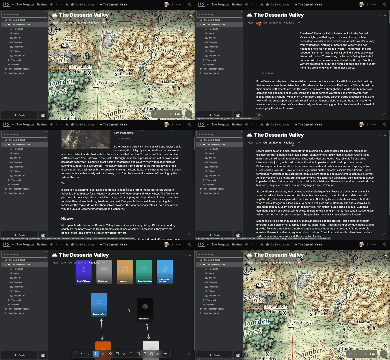
When the update arrives, LK 0.12 will change the layout of your project in a few ways. Just to make it clear... this update is not shipping yet. This is just a preview of some of the major changes. ✌️

- LegendKeeper's main navbar will be moving to the top, and all "system" functions like account and project settings are moving to a more obvious global menu in the top left.
- The separation of "wiki," "atlas," and "boards" is going away. All wiki pages, maps, and boards will live in one unified project tree called the "project browser".
- The project browser will always be accessible from the left side. You can dive through all of your "elements" from here to explore their maps, pages, and boards.
- An "element" can have any number of tabs, and these tabs can be maps, wiki pages, or boards. (For example, in the above GIF, "The Dessarin Valley" is an element, and it has four tabs: "Map", "Lore", "Current Events", and "Factions.")
- The asset manager is moving to a small button in the bottom left, next to the "Create" button.
- The element sidebar on the right can be shown and hidden at will, even on maps and boards. We'll also be adding useful new blocks to this sidebar, such as list blocks and custom text blocks.
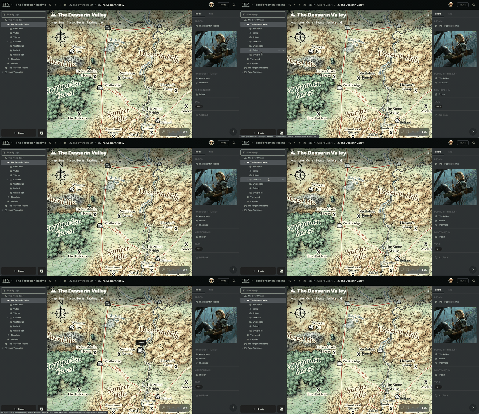
- "Blocks" on the right sidebar will support renaming, reordering, and hiding.
- The "pin list" on maps will be moving to a tab in the element sidebar on the right. (You can see the "Map" tab on the right sidebar in the GIF below.)

This update will radically improve LegendKeeper's workflow. I know changes can be jarring, especially for long-time users, but I've been using the dev version of 0.12 for myself. I find it difficult to go back to the current version of LegendKeeper! Let me know what you think of all this in Discord.
Content
Adam and Carson (writer of our awesome magic system article) have been working on a couple of big articles for our blog. We tried to get those shipped out this week, but it turns out fantastic content takes time! 😅 One of those articles is a round-up on the best map-making software, so if you have some hot takes on cartography, please chime in on Discord!
Community Spotlight
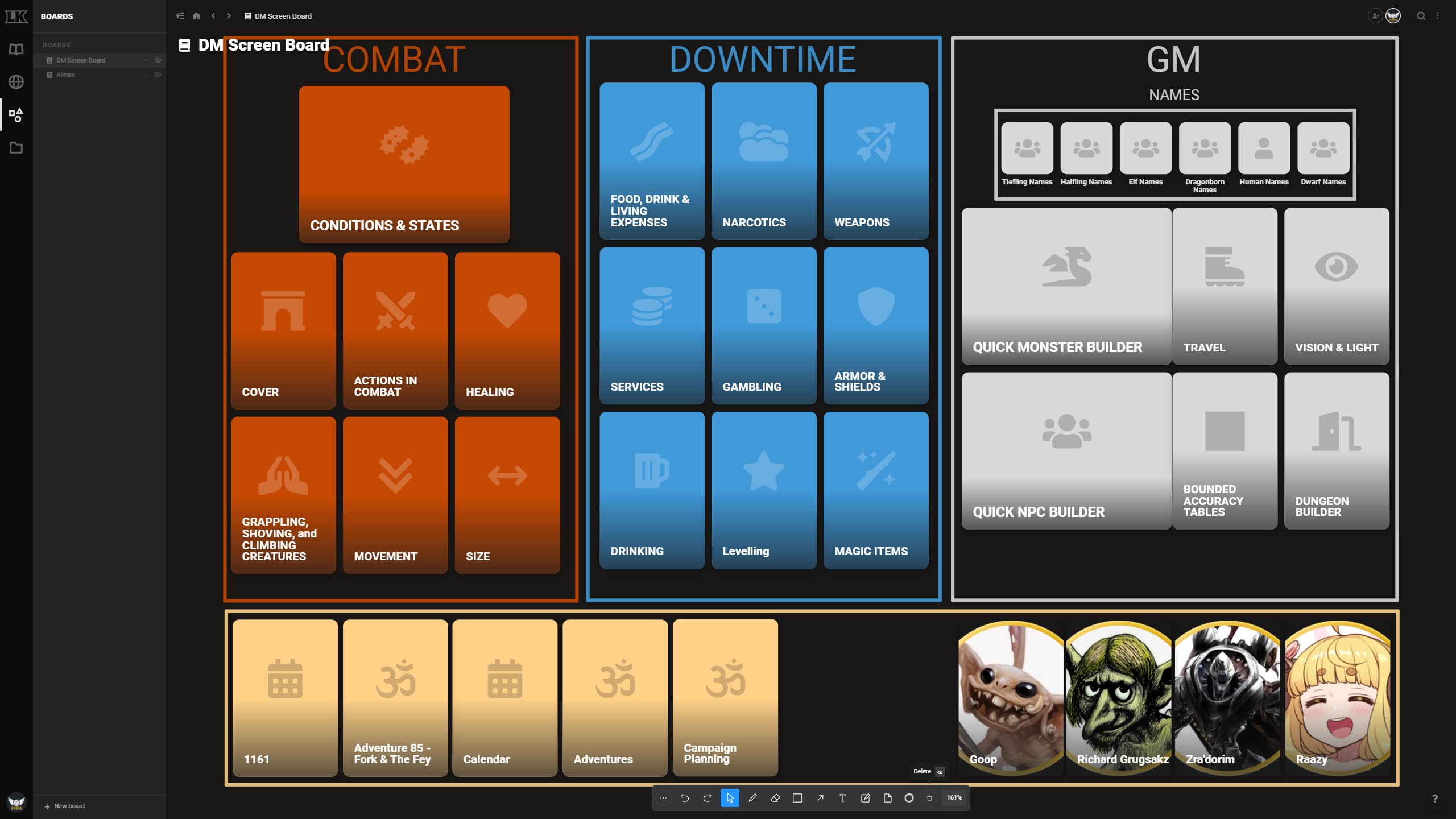
Anto over at Icarus Games uses LK's Board feature to create an interactive DM screen.

You can see more of his project in his tweet here:
In terms of free options, I use Microsfot OneNote, which I've made a whole GM Bible for: https://t.co/LW0vYB7ibX
— Anto | SIDEQUEST Magazine on Patreon (@IcarusGamesUK) May 7, 2022
But I've actually completely switched over to @legendkeeperapp. I've got a digital GM screen there, a map of my world, and a full wiki (shared with my players) pic.twitter.com/kxLlk6LxUv
Reb Blob Games
One more social mention--If you like programming, simulationism, and maps, you should definitely know about Amit Patel at Red Blob games. His blog has years of articles on algorithms and techniques for creating worlds. It's always a fascinating read.
Just for fun. The #mapgen4 code had much more potential than what the web page showed off, but a lot of it didn't fit the "interactively paint a map" goal for the web page. pic.twitter.com/eeJl71y04a
— Amit Patel (@redblobgames) May 7, 2022
That's all for now!
TEAM LK
