EDIT: FYI, there's a bit of jank with the update process. Clicking the update button may not trigger a refresh; I'm not sure why this is as I haven't touched anything here. If you get stuck, hold Shift and click Refresh. If you see a blank screen, refresh again.
Hey everyone, I have a mega update for you today! This update has been a long time coming—it's both a UI style overhaul, as well as a complete re-imagining of the LegendKeeper workflow. We think this update makes LegendKeeper both simpler and more powerful!
Overview
At a glance, this update adds:
- A style overhaul for the UI.
- A unified way to interact with LK. Wiki pages, maps, and boards are now types of tabs, and your project's elements can have any number of tabs.
- Introduction of drag and droppable "blocks" for the property bar.
- Introduces new drag and drop interactions for maps and boards.
- Dozens of small features and improvements.
! Important !
Once a page is opened in 0.12, it won't show its map or preview image in old versions anymore. It's not broken; it's just been migrated and needs to be viewed in 0.12. Be sure to let any collaborators know to update. (Click the update button on the popup that appears, or click Shift + Refresh.)
Why tho?
You can find a deep dive into our philosophy for this update on the blog post here. Keep in mind the screenshots on that post are outdated. (Also rofl at me thinking it would take a few weeks. Classic.)
UI Overhaul
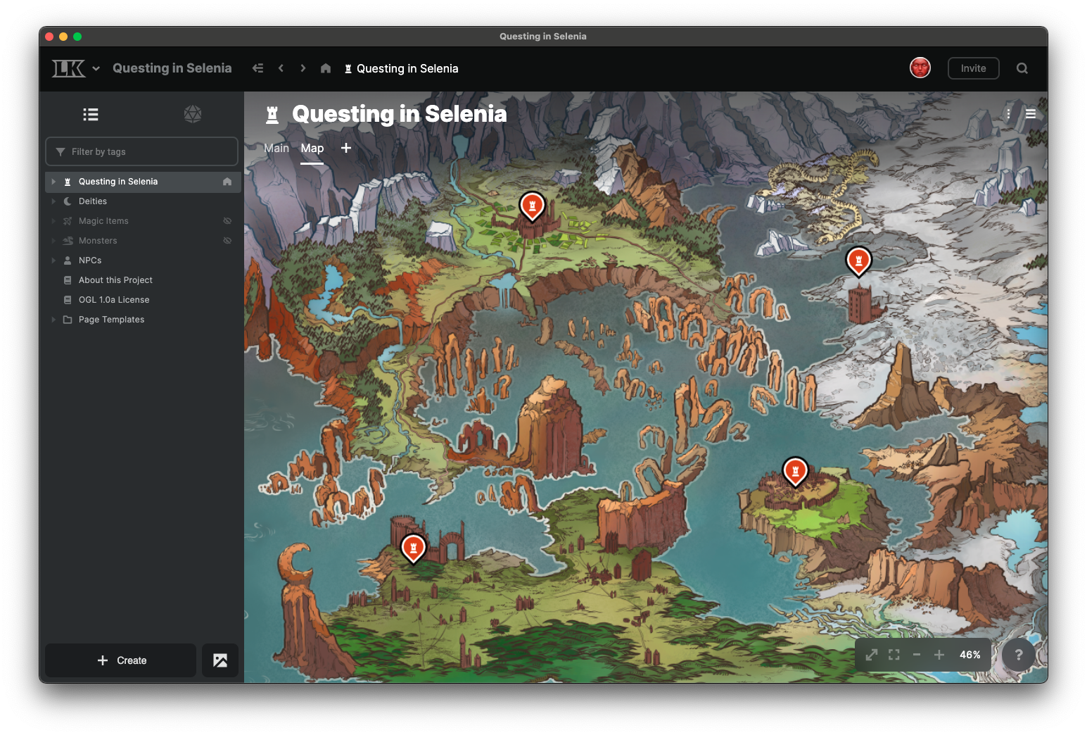
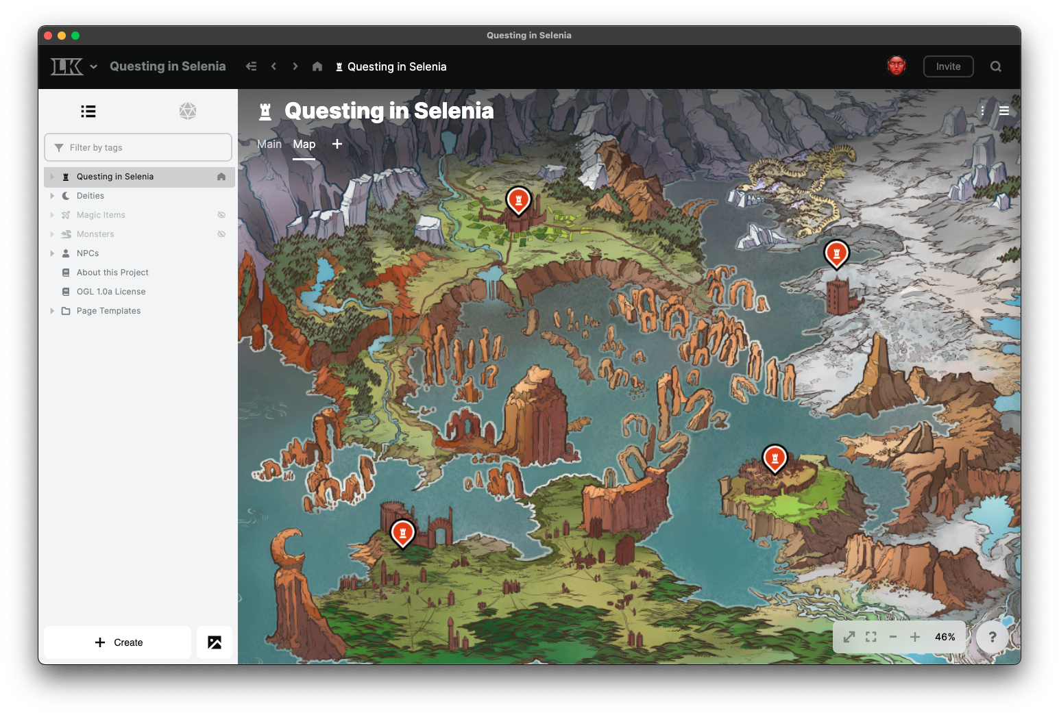
LK now has a navigation bar at the top.
New color palettes for light and dark mode.
Introduced new font face for readability.
Increased font size for editor, and most font sizes across the board.
New UI components and styles for most of the LK client.
Project UX Changes
The Atlas, Board, and Asset tabs have been removed.
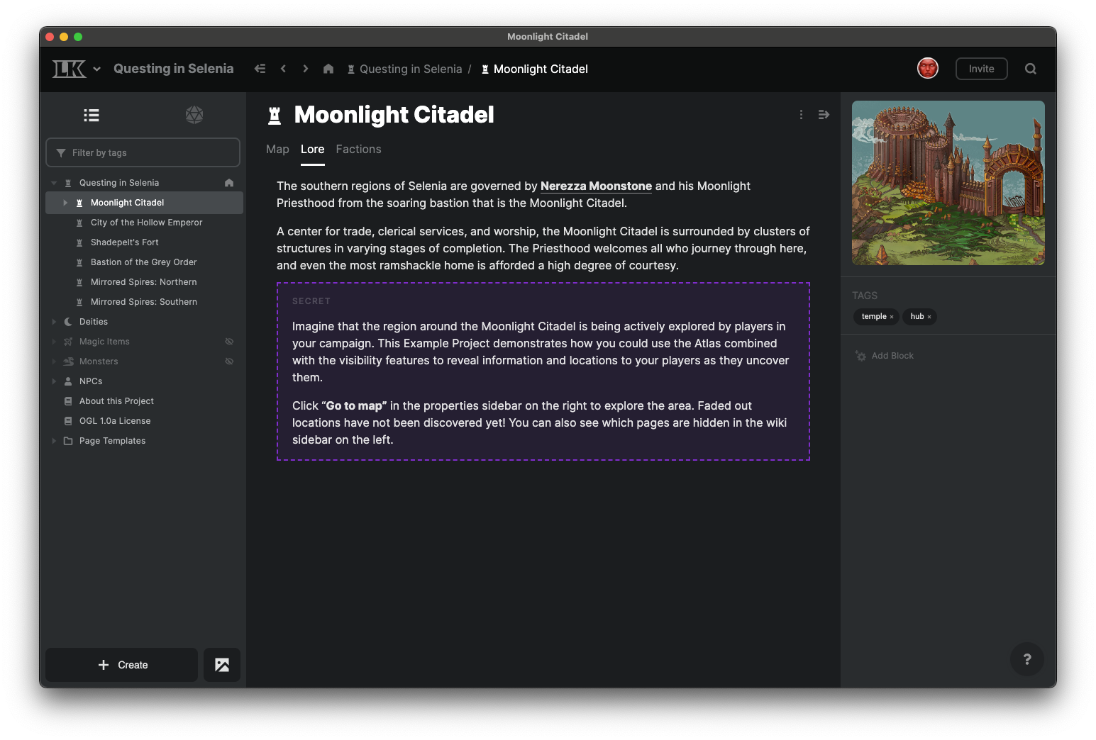
A “thing in your project with a name, icon, and tags” (what we called a “page” before) is now called an “element”.
Page, Map, and Board are now tab types for an element, and an element can have any number of page, map, or board tabs.
The sidebar on the left is now called the “project browser” and will always show a directory of your project’s elements.
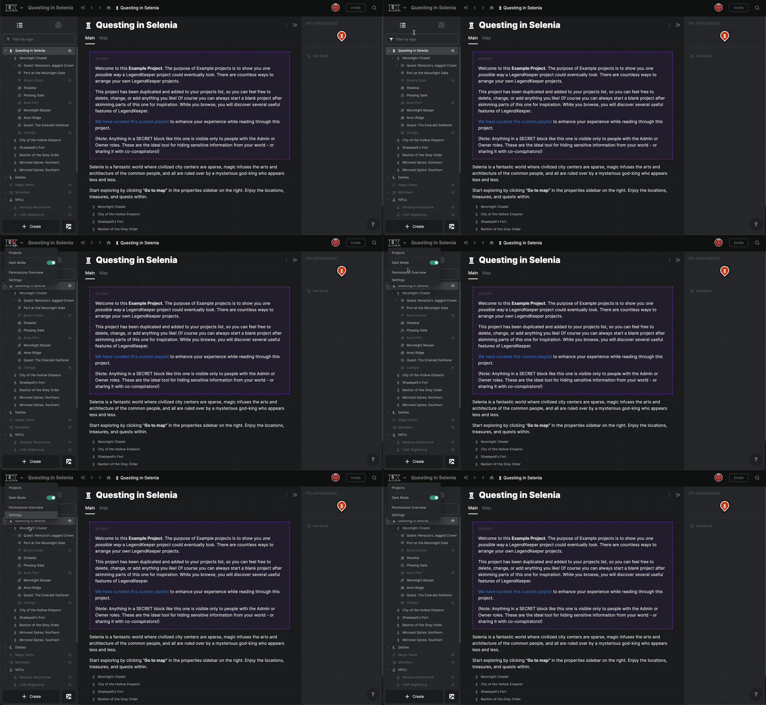
"Project-wide" operations, such as opening project settings or the permissions overview, are now located in the project menu in the top left.
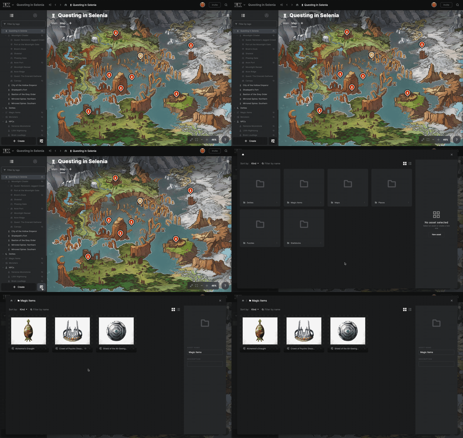
The asset manager has moved to a small button next to the create button in the bottom left.
The project home is now indicated by a Home icon in the project browser.
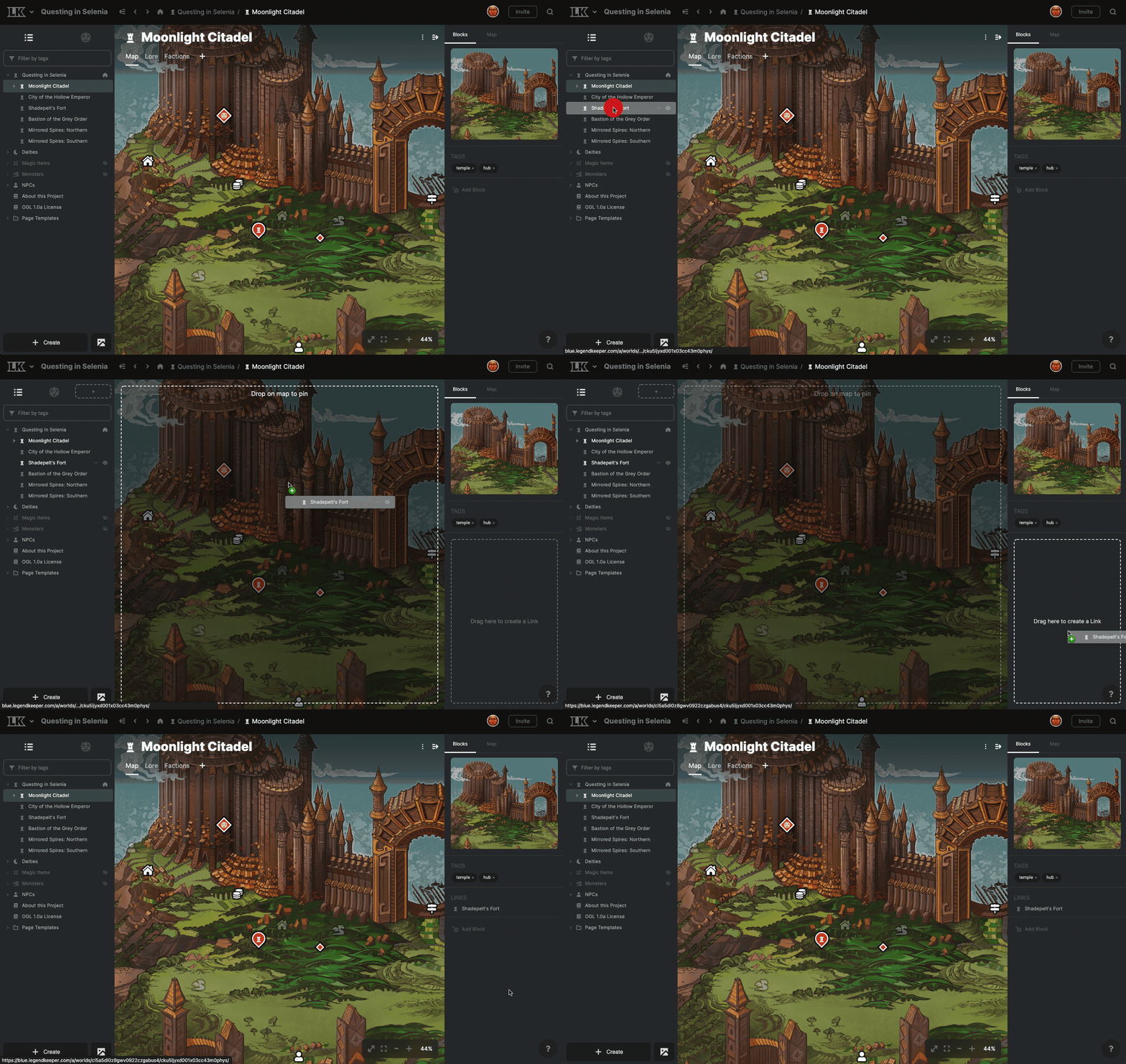
Prompts are now shown in places where you can make a meaningful drag&drop interaction.
The currently active shortcut is used as the default parent when the create button is pressed.
Removed all dialog-based editing. You now must navigate to the full page to edit. This simplifies the app and removes a lot of cognitive burden on users (and on me 😁).
Map Changes
Maps now have “smooth zoom”, instead of stepped zoom.
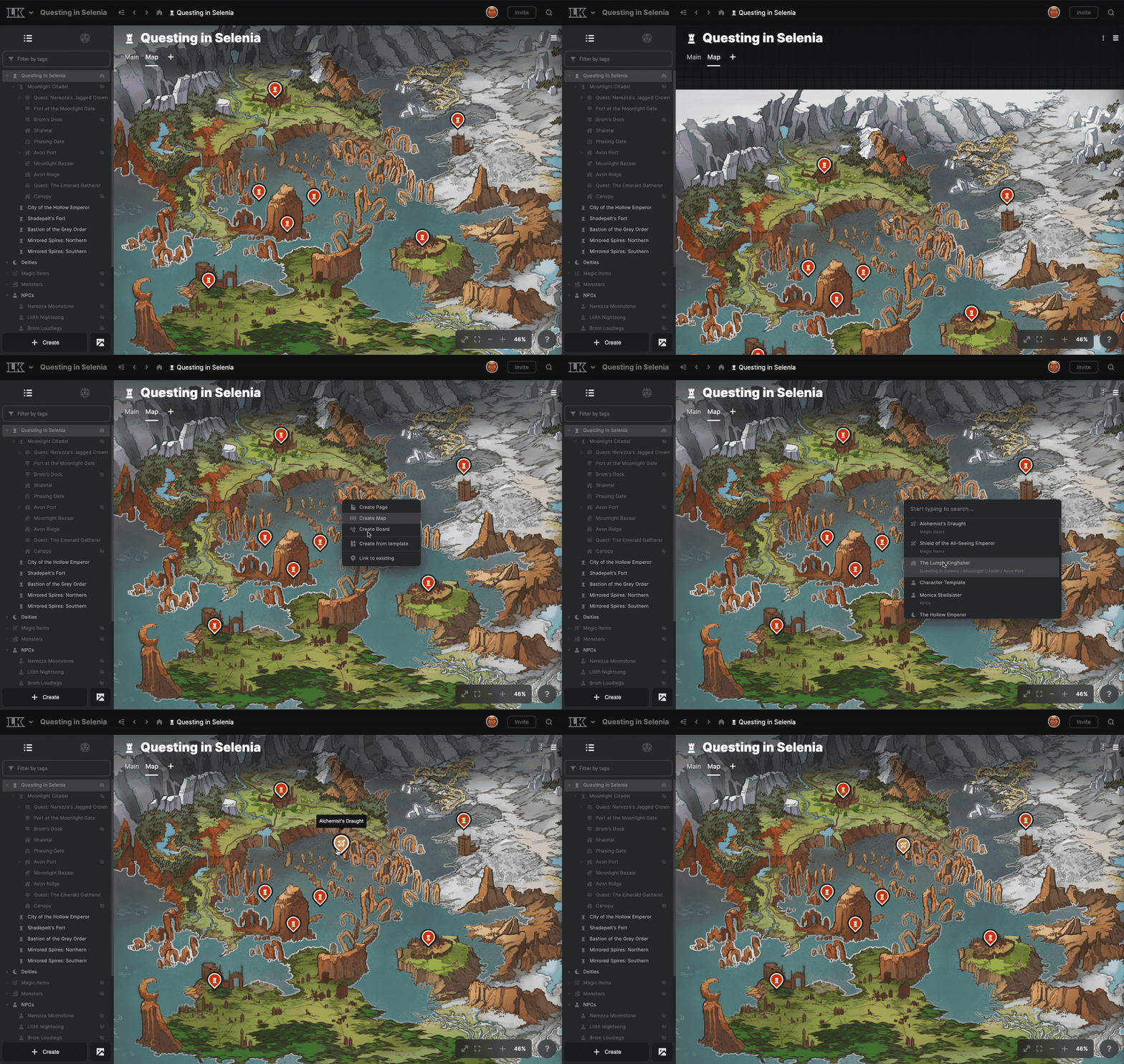
The “Link to existing with a pin” workflow has been smoothed out.
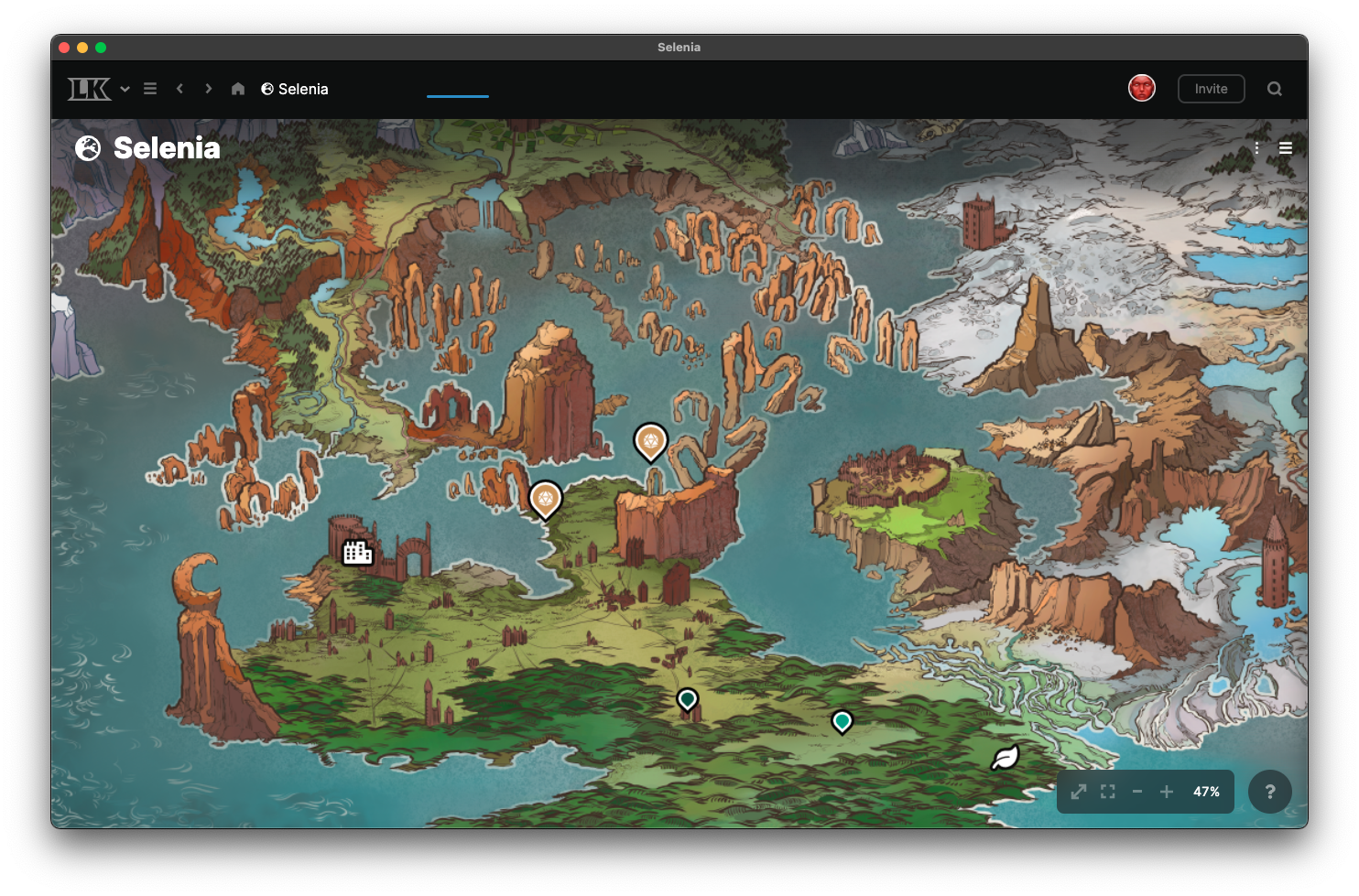
Thanks to the top navbar, you can view your map edge-to-edge, which is pretty cool.
You can drag elements from the project browser onto a map to quickly create a pin.
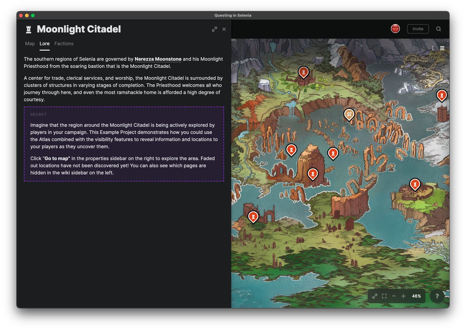
The flyout preview that appears when clicking a map pin now includes tabs and will also preview maps and boards.
Pin locking and pin clustering have been moved to the element menu in the top right.
The “pin list” for maps has been moved to a tab in the panel on the right. Future additions to map tools, such as image layers and overlays, will be added here.
Double-clicking or shift-clicking a pin navigates you to that pin’s page.
Editing has been disabled in the map flyout. We'd like editing to be a more centralized experience.
Board Changes
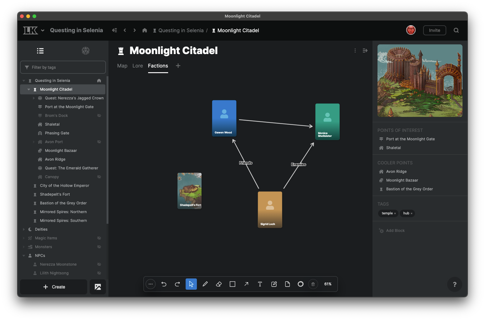
Boards have been merged into the new unified project browser and are now a type of tab for an element.
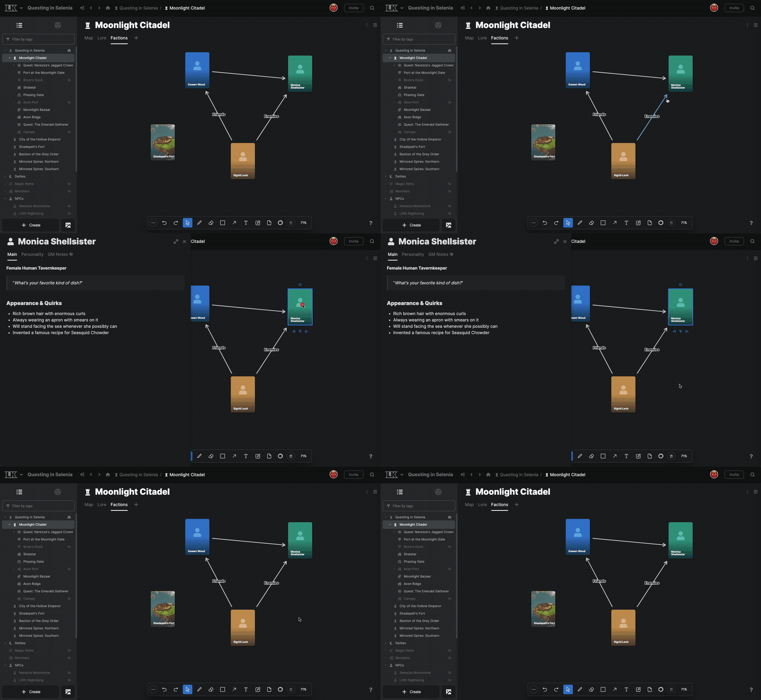
Clicking a board card now opens the flyout preview. This still needs some tweaking; I think it will get in the way in some situations.
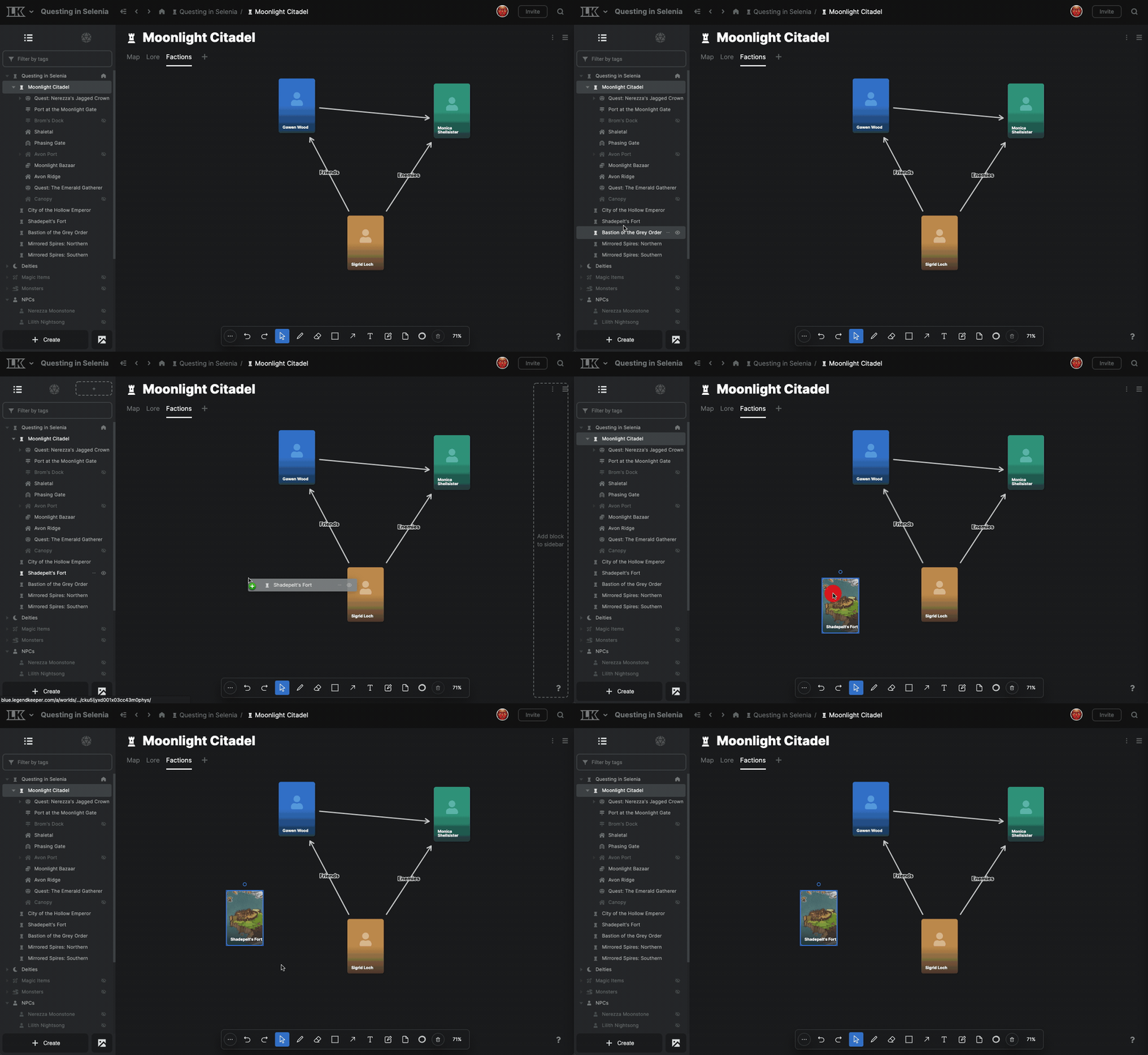
You can drag elements from the project browser onto a board to quickly create a board card.
By default, most board tools now switch back to the Select tool once used. If you double-click the tool in the toolbar to latch it, it stays selected even after using it.

Double-clicking or shift-clicking a board card navigates you to that card’s page.
Board cards that display an image now try to respect the image’s crop settings.
Board card icon opacity has been increased.
Page Changes
The full-width toggle now applies only to the tab it is set on, rather than all page tabs on an element.
Page versions can now be restored via the versions menu by pressing the “restore” button. A known visual bug causes the red/green “change preview” to persist even after restoring; navigate away and return to see the restored document. I'll patch this in the near future.
The table of contents block now attempts to account for headings nested in layouts and info panels, though this will probably lead to some unexpected behavior.
All elements

Elements now show a “Hidden” indicator when they are hidden.
Elements now show a “Locked” indicator when they are locked.
Properties Changes
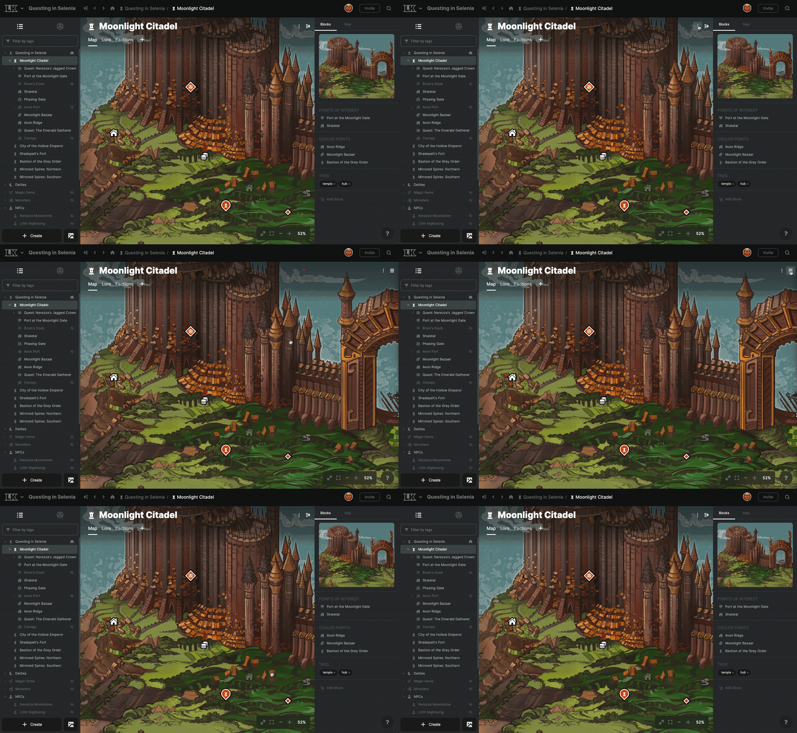
The right sidebar of an element can now be open and closed at will.
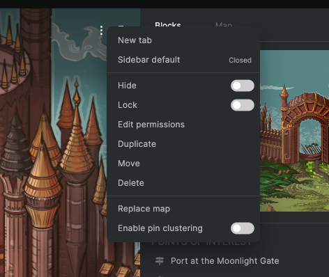
You can choose whether the sidebar is open or closed by default.
If the right sidebar is empty and the viewing user can’t edit it, it serves no purpose and is automatically closed.
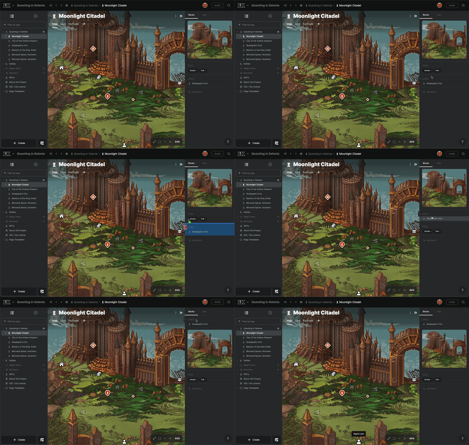
"Blocks" in the right sidebar can be re-ordered via drag and drop.
You can drag elements from the project browser to the right sidebar to quickly create a custom link.
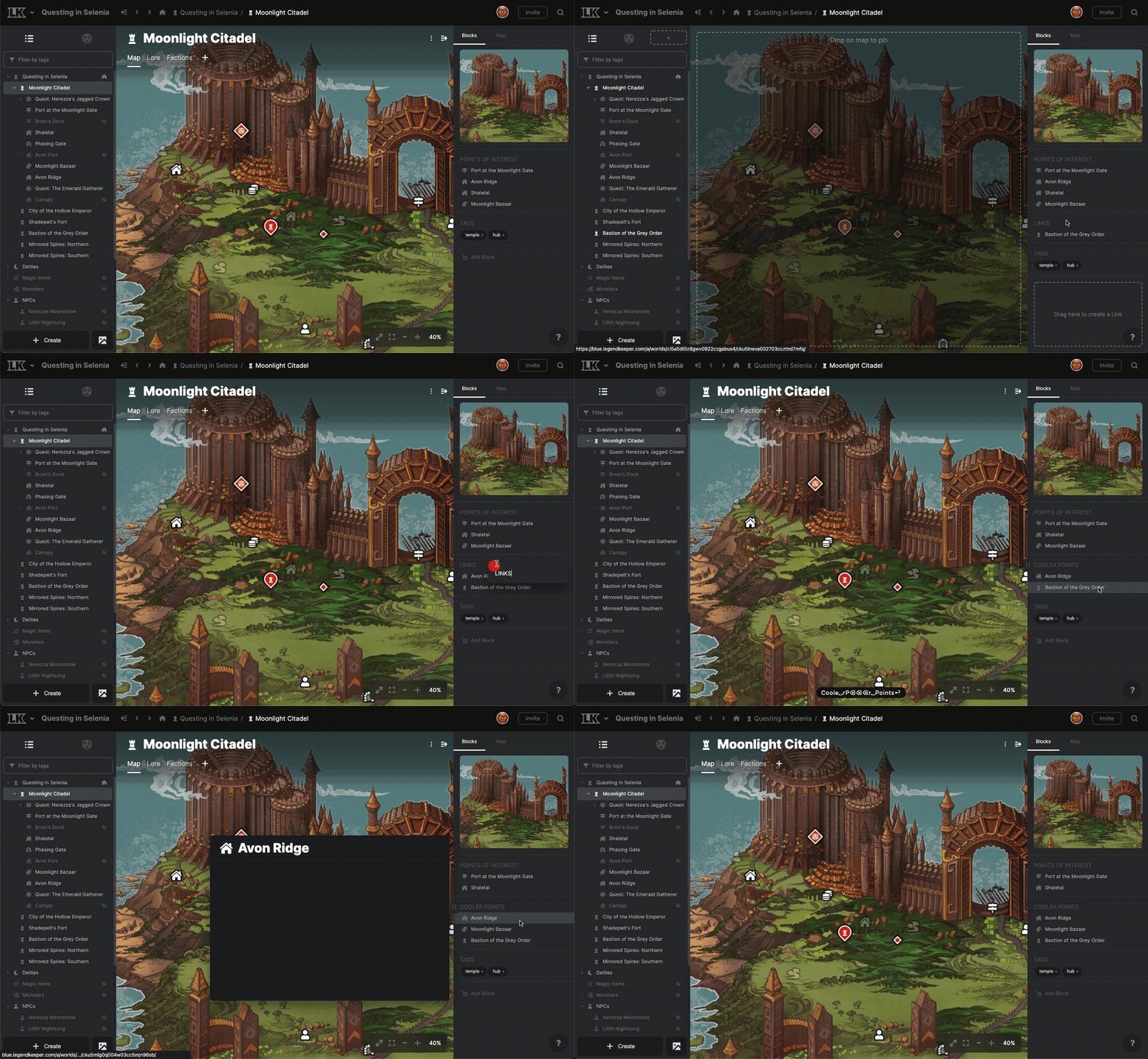
You can drag a custom link in the right sidebar into another link to add to the list of links.
Elements can have multiple of the same types of blocks; for example, multiple images or link lists. This will make more sense as we introduce new block types, such as text fields.
An element’s first image block is used in situations where the “preview image” was used in pre-0.12. (Future updates will introduce the ability to select among an element’s image blocks in linking situations.)
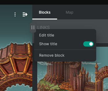
Block titles can be hidden or customized via the hover menu.
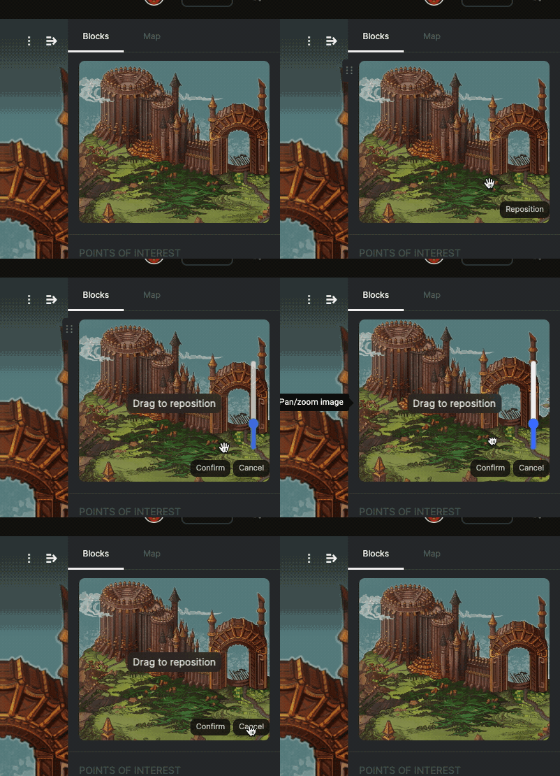
The image cropper has been overhauled; now you select the “reposition” option on an image to enable repositioning mode. This prevents accidental edits.
Numerous bug fixes and enhancements.
What's next?
Whew, that was a lot! I probably missed a few things. Like most big updates, I expect this one to generate a lot of maintenance, feedback, and support requests, so that will be my primary focus. I also have a bunch of documentation and marketing materials to update with the new UI. I also need to update the example projects; they aren't organized to show 0.12's strengths.
Once all these launch things settle down, I will start work on 0.12.x.x minor updates that include things like drag and drop interactions for tabs, and other things that were cut from 0.12 for time reasons. Following that, I'll resume work on the 0.13 editor update.
Too soon to speak on it in depth now, but it's likely that 0.14 will relate to both public worlds and mobile support. That's subject to change and a month or more out from now though, so more on that later.
Thanks for your patience on this one! This update was particularly large, and not realistic to release piecemeal due to its monolithic nature. Thank you again for all your support; working on LK is my dream job and I'm excited to keep improving it. :)